
Looker Studio is a popular business intelligence and data analytics platform many organizations use to gain insights and make data-driven decisions. However, several alternatives to Looker Studio offer similar or even better functionalities.
According to G2, a well-known software review platform, several Looker Studio alternatives are gaining popularity among users. Here are some statistics and facts regarding Looker Studio's competitors and alternatives:
- Tableau is the most popular alternative to Looker Studio, with a market share of 30.8%, followed by Microsoft Power BI with 23.9%.
- Other Looker Studio competitors with significant market shares include QlikView, SAP BusinessObjects, and IBM Cognos Analytics.
- Looker Studio has a satisfaction rating of 4.3 out of 5 on G2, while Tableau has a rating of 4.5 out of 5, and Microsoft Power BI has a rating of 4.4 out of 5.
- Some of the factors that users consider when choosing Looker Studio competitors include ease of use, data visualization capabilities, and data integration capabilities.
In this article, we will discuss the top Looker Studio alternatives you can consider for your business needs. To give you better context, we’ll also cover what Looker Studio is and why you should consider switching to another tool.
What is Looker Studio?
Looker Studio is a business intelligence and data analytics platform that allows organizations to gain insights and make data-driven decisions. It offers a wide range of features, including data exploration, reporting, and dashboarding, and it can be integrated with various data sources and cloud platforms.
Looker Studio aims to make data more accessible and understandable for all users, regardless of their technical background.
Recently, Looker Studio underwent a rebranding from Data Studio to Looker Studio. This change reflects the evolution of the platform and its expanding capabilities beyond data visualization.
Going forward, we will be using Looker Studio instead of Data Studio for our data visualization and analysis tasks. The new name better reflects the platform's emphasis on providing insights and driving action from data rather than just visualizing it.
Top Reasons to Switch from Looker Studio
Here are some reasons why you might consider looking for alternatives to Looker:
- Limited visualization options: While Looker Studio offers some basic visualization options, more is needed for businesses that require more advanced visualizations.
- Steep learning curve: Looker Studio can be complex and difficult to learn, especially for users without a technical background.
- Limited data processing capabilities: Looker Studio may need help with processing large and complex datasets, making it less suitable for certain businesses.
- Limited customization options: Customizing Looker Studio reports, and dashboards can take time, limiting the platform's flexibility.
- Pricing: Looker Studio can be expensive, especially for small businesses with limited budgets.
Alternatives to Looker Studio, such as Tableau and Microsoft Power BI, offer more advanced visualization options, easier-to-use interfaces, better data processing capabilities, more customization options, and more affordable pricing plans.
If you need help with Looker Studio's limitations, exploring some of these Looker or more commonly known as Google Data Studio alternatives, may be worth exploring.
Top Alternatives to Looker Studio for Data Visualization and Analysis
Here are some of the top alternatives to Looker Studio or Google Data Studio alternatives for data visualization and analysis:
1. Arena Calibrate
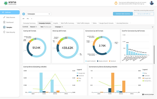
Arena Calibrate is a cloud-based project management and collaboration tool that is designed to help teams manage their tasks, projects, and workflows more efficiently. It offers a wide range of features such as project tracking, task management, time tracking, reporting, and collaboration tools that can be accessed from any device with an internet connection.
Arena Calibrate aims to streamline the entire project management process, from planning to execution, by providing a single platform where team members can collaborate and communicate effectively.
Top Features
- Project Tracking: Track project progress, monitor milestones, and ensure that everything is on track.
- Task Management: Assign tasks, set deadlines, and track their progress.
- Reporting: Generate custom reports and track project metrics in real time.
- Time Tracking: Track the time spent on each task and project.
- Collaboration: Communicate and collaborate with team members using integrated messaging and commenting features.
- Customization: Customize Arena Calibrate to fit your team's unique needs and workflows.
- Mobile App: Access Arena Calibrate on the go using the mobile app.
Data Connectivity and Integration
Arena Calibrate offers integration with a variety of third-party tools, including GitHub, Jira, and Asana, allowing users to import and export data between platforms easily. Additionally, Arena Calibrate's API provides a flexible and powerful way to connect to other tools and systems.
With Arena Calibrate's data connectivity and integration features, users can easily share data across platforms, streamline workflows, and eliminate duplication of effort.
Data Visualization and Analysis
Arena Calibrate's reporting and data visualization features allow users to gain valuable insights into their projects and team performance. Customizable dashboards and reports provide real-time visibility into project status, team workload, and resource allocation.
With Arena Calibrate's data analysis tools, users can make informed decisions and take action to improve project outcomes.
Collaboration and Sharing
Arena Calibrate's collaboration and sharing features are designed to help teams communicate more effectively and work together seamlessly. Users can share files, assign tasks, and collaborate in real time using integrated messaging and commenting features.
With Arena Calibrate, teams can work together regardless of location, making collaborating and staying connected easier.
Pricing:
Arena offers a free plan with limited features and paid plans starting at $9/user/month. The pricing plans are based on the number of users and the level of features required.
Pros:
- Comprehensive project management and collaboration features
- Easy integration with third-party tools
- Customizable to fit unique team needs and workflows
- Real-time reporting and data visualization
- Mobile app for on-the-go access
Cons:
- Limited customization options for free plan
- No built-in time tracking feature in the free plan
- Steep learning curve for new users.
2. Tableau
Overview
Tableau is a widely-used data visualization and business intelligence platform that allows users to create interactive dashboards, reports, and charts. It offers an intuitive drag-and-drop interface that enables users to easily connect to and analyze their data, without requiring extensive technical knowledge.
Tableau supports a wide range of data sources and offers both on-premises and cloud-based deployment options.
Top Features
- Interactive dashboards and reports with easy drag-and-drop functionality
- Extensive data visualization options, including charts, graphs, and maps
- Advanced analytics and statistical modeling capabilities
- Seamless integration with various data sources, including databases, spreadsheets, and cloud platforms
- Ability to share and collaborate on data insights with others
Data Connectivity and Integration
Tableau offers a wide range of connectivity options to various data sources, including popular databases like MySQL, Oracle, and SQL Server, as well as cloud platforms like AWS, Google Cloud, and Microsoft Azure.
Tableau also allows users to connect to data in spreadsheets, web-based data sources, and other data sources through APIs.
Tableau offers data preparation tools that allow users to clean, transform, and aggregate data before analysis. The platform's data connectors allow for real-time data streaming and it has the ability to join and blend data from multiple sources.
Data Visualization and Analysis
Tableau offers a wide range of data visualization options, including charts, graphs, maps, and dashboards, that are designed to help users uncover insights and trends in their data. Tableau allows for advanced calculations, visualizations, and statistical modeling, such as forecasting and clustering.
Users can interact with their data visualizations, drill down into specific data points, and create custom filters to refine their analysis. Tableau's natural language processing tool, Ask Data, allows users to ask questions and get insights from their data using natural language queries.
Collaboration and Sharing
Tableau offers various sharing options to collaborate with others, including dashboards, stories, and workbooks. Users can share their insights with others via email, web links, or Tableau Server. Tableau Server allows organizations to share data and collaborate on projects within a secure, centrally managed environment.
Pricing:
Tableau offers a range of pricing options, including individual plans starting at $12 per user per month and enterprise plans tailored to specific business needs. A free trial is available for users who want to test out the platform before committing to a subscription.
Pros:
- User-friendly interface with easy drag-and-drop functionality
- Extensive data visualization options and advanced analytics capabilities
- Wide range of connectivity options to various data sources
- Ability to share and collaborate on data insights with others
- Robust community and support resources
Cons:
- High pricing for enterprise plans
- Steep learning curve for advanced features and capabilities
- Limited customization options for visualizations
- Large datasets can be slow to process and load
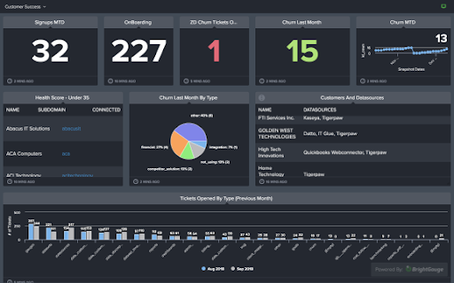
3. BrightGauge
Overview
BrightGauge is a data analytics and visualization platform that allows businesses to track and display key performance metrics in real time. It offers a range of integrations with popular data sources, including CRMs, PSA tools, financial platforms, and more.
BrightGauge's intuitive dashboards and reports enable businesses to stay informed and make data-driven decisions.
Top Features
- Customizable dashboards and reports with real-time data
- Integrations with popular data sources, including CRMs and PSA tools
- Automated data collection and visualization
- Advanced filtering and sorting options
- Easy-to-use data visualization tools
Data Connectivity and Integration
BrightGauge offers integrations with over 70 data sources, including CRMs like Salesforce, ConnectWise, and HubSpot, PSA tools like Autotask and ServiceNow, financial platforms like QuickBooks and Xero, and more. It also offers a RESTful API for custom data integrations.
BrightGauge allows users to automate data collection and visualization, eliminating the need for manual data entry and manipulation. Users can create custom data queries and set up alerts to stay informed of any changes or anomalies in their data.
Data Visualization and Analysis
BrightGauge's customizable dashboards and reports allow users to display key performance metrics in real-time, enabling them to stay informed and make data-driven decisions. Users can create custom charts, graphs, and tables to visualize their data and apply filters and sorting options to refine their analysis.
BrightGauge's data visualization tools are user-friendly, making it easy for users to create and edit their dashboards and reports without requiring extensive technical knowledge.
Collaboration and Sharing
BrightGauge offers various sharing options to collaborate with others, including dashboards, reports, and gauges. Users can share their insights with others via email, web links, or a public URL.
BrightGauge also offers role-based access control, allowing users to control who can view and edit their data.
Pricing:
BrightGauge offers a range of pricing options, starting at $39 per user per month for its Core plan, which includes up to 5 data sources and unlimited dashboards. Its Pro and Enterprise plans offer additional features and integrations, with pricing tailored to specific business needs.
A free trial is available for users who want to test out the platform before committing to a subscription.
Pros:
- Easy-to-use data visualization tools
- Integrations with over 70 popular data sources
- Real-time data collection and visualization
- Customizable dashboards and reports
- Affordable pricing for small to mid-sized businesses
Cons:
- Limited customization options for visualizations
- No mobile app for accessing data on-the-go
- Steep learning curve for advanced features and capabilities
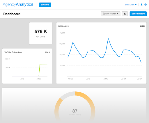
4. AgencyAnalytics
Overview
AgencyAnalytics is an all-in-one reporting and dashboard solution for digital marketing agencies. It provides a wide range of features for SEO, PPC, social media, and other digital marketing channels.
With AgencyAnalytics, agencies can track their clients' progress, monitor their campaigns, and generate custom reports to showcase their success.
Top Features
- All-in-one reporting and dashboard solution
- Integrations with over 60 popular data sources
- Customizable dashboards and reports with white-labeling options
- Automated report scheduling and delivery
- Keyword and website rank tracking
Data Connectivity and Integration
AgencyAnalytics integrates with over 60 popular data sources, including Google Analytics, Google Search Console, Facebook Ads, and more. It also offers a range of custom data integrations via its API, allowing agencies to connect to any data source they require.
AgencyAnalytics provides automated data collection, allowing users to access real-time data at any time. It also offers custom data queries and filtering options, allowing users to refine their data analysis and generate more accurate reports.
Data Visualization and Analysis
AgencyAnalytics offers customizable dashboards and reports, allowing users to create and edit their reports as needed. It provides a wide range of visualization options, including graphs, charts, and tables. Its reporting features also include white-labeling options, enabling users to add their branding to reports.
AgencyAnalytics provides advanced data analysis tools, allowing users to track website and keyword rankings, analyze social media engagement, and monitor other metrics related to their digital marketing campaigns.
Collaboration and Sharing
AgencyAnalytics offers a range of sharing options, including email, web links, and direct integration with client portals like WordPress and Shopify. Its automated report scheduling and delivery features allow users to save time by scheduling reports to be delivered automatically to clients on a regular basis.
AgencyAnalytics also offers a team collaboration feature, allowing users to assign tasks and collaborate with team members on reports and other digital marketing tasks.
Pricing:
AgencyAnalytics offers a range of pricing plans, starting at $49 per month for its Basic plan, which includes up to 5 campaigns and unlimited users. Its other plans include the Plus, Premium, and Enterprise plans, with pricing tailored to specific business needs.
A 14-day free trial is available for users who want to test out the platform before committing to a subscription.
Pros:
- Integrations with over 60 popular data sources
- Automated report scheduling and delivery
- Customizable dashboards and reports with white-labeling options
- All-in-one reporting and dashboard solution for digital marketing agencies
- Affordable pricing for small to mid-sized businesses
Cons:
- Limited customization options for visualizations
- No mobile app for accessing data on-the-go
- Steep learning curve for advanced features and capabilities
5. Databox
Overview
Databox is a business analytics platform that helps users track and analyze their key performance indicators (KPIs) in real-time. It provides a range of pre-built integrations with popular data sources, including Google Analytics, HubSpot, Salesforce, and more. Databox offers a range of visualization options, enabling users to create and customize dashboards to fit their unique business needs.
Top Features
- Pre-built integrations with over 70 data sources
- Customizable dashboards with real-time data
- Mobile app for on-the-go data access
- Automated report delivery and data alerts
- Data benchmarking and goal-setting
Data Connectivity and Integration
Databox integrates with over 70 popular data sources, including Google Analytics, HubSpot, Salesforce, and more. It offers a range of custom data integrations via its API, allowing users to connect to any data source they require.
Databox provides real-time data access, enabling users to view their KPIs at any time. It also offers data benchmarking and goal-setting features, allowing users to compare their performance against industry standards and set targets for improvement.
Data Visualization and Analysis
Databox offers a range of visualization options, including charts, tables, and goal meters. Its dashboard builder allows users to customize their dashboards with real-time data, custom colors, and branding options.
Databox provides a range of advanced data analysis tools, including data segmentation and filtering options. Its reporting features include automated report delivery and data alerts, informing users about their KPIs without constantly checking the dashboard.
Collaboration and Sharing
Databox allows users to share their dashboards and reports with team members, clients, and other stakeholders. Its mobile app provides on-the-go data access, allowing users to stay informed even when they are away from their desks.
Databox also offers a range of collaboration features, including comment threads and task assignments, allowing team members to work together on data analysis and reporting.
Pricing:
Databox offers a range of pricing plans, starting at $49 per month for its Basic plan, which includes up to 3 data sources and 1 user. Its other plans include the Plus, Business, and Enterprise plans, with pricing tailored to specific business needs.
A 14-day free trial is available for users who want to test out the platform before committing to a subscription.
Pros:
- Pre-built integrations with over 70 popular data sources
- Customizable dashboards with real-time data
- Automated report delivery and data alerts
- Mobile app for on-the-go data access
- Affordable pricing for small to mid-sized businesses
Cons:
- Limited customization options for visualizations
- No direct integrations with social media platforms
- Limited data modeling capabilities for advanced users
6. DashThis
Overview
DashThis is a reporting and dashboard creation tool that allows businesses to track, analyze, and report on their digital marketing and advertising campaigns in real-time.
The tool offers a user-friendly interface and a variety of customizable templates that can be used to create professional reports quickly and easily. DashThis is designed to help businesses gain valuable insights into their campaigns, make data-driven decisions, and optimize their marketing efforts for better results.
Top Features
- Customizable Dashboards: Create custom dashboards to track and visualize key performance metrics.
- Automated Reporting: Schedule automated reports to be sent to clients, team members, or stakeholders.
- Multi-Channel Integration: Connect with a wide range of data sources, including Google Analytics, Facebook, Instagram, and more.
- White Labeling: Customize the look and feel of the dashboards to match your brand.
- Collaboration: Share dashboards and reports with team members and clients to encourage collaboration and transparency.
- Drag-and-Drop Interface: Easily create and customize dashboards with a drag-and-drop interface.
- Customizable KPIs: Choose from a variety of pre-built KPIs or create custom ones to track the metrics that matter most.
Data Connectivity and Integration
Databox integrates with over 70 popular data sources, including Google Analytics, HubSpot, Salesforce, and more. It offers a range of custom data integrations via its API, allowing users to connect to any data source they require.
Databox provides real-time data access, enabling users to view their KPIs at any time. It also offers data benchmarking and goal-setting features, allowing users to compare their performance against industry standards and set targets for improvement.
Data Visualization and Analysis
Databox offers a range of visualization options, including charts, tables, and goal meters. Its dashboard builder allows users to customize their dashboards with real-time data, custom colors, and branding options.
Databox provides a range of advanced data analysis tools, including data segmentation and filtering options. Its reporting features include automated report delivery and data alerts, informing users about their KPIs without constantly checking the dashboard.
Collaboration and Sharing
Databox allows users to share their dashboards and reports with team members, clients, and other stakeholders. Its mobile app provides on-the-go data access, allowing users to stay informed even when they are away from their desks.
Databox also offers a range of collaboration features, including comment threads and task assignments, allowing team members to work together on data analysis and reporting.
Pricing:
Databox offers a range of pricing plans, starting at $49 per month for its Basic plan, which includes up to 3 data sources and 1 user. Its other plans include the Plus, Business, and Enterprise plans, with pricing tailored to specific business needs.
A 14-day free trial is available for users who want to test out the platform before committing to a subscription.
Pros:
- Pre-built integrations with over 70 popular data sources
- Customizable dashboards with real-time data
- Automated report delivery and data alerts
- Mobile app for on-the-go data access
- Affordable pricing for small to mid-sized businesses
Cons:
- Limited customization options for visualizations
- No direct integrations with social media platforms
- Limited data modeling capabilities for advanced users
7. Klipfolio

Overview
Klipfolio is a cloud-based business intelligence (BI) tool that allows users to create custom dashboards for monitoring and analyzing data from various sources. With Klipfolio, users can connect to over 100 data sources, including spreadsheets, databases, and web applications, to create visualizations and reports that can be shared with others.
Top Features
- Connect to over 100 data sources
- Drag-and-drop dashboard creation
- Interactive data visualizations
- Automated data refreshing
- Collaboration and sharing features
- Mobile app for iOS and Android
Data Connectivity and Integration
Klipfolio offers a wide range of data connectors, including popular business applications such as Salesforce, Google Analytics, and HubSpot, as well as databases like MySQL and PostgreSQL. The tool also provides access to REST APIs, webhooks, and JSON data, making it easy to bring in data from almost any source.
Klipfolio's data integration features allow users to combine multiple data sources into a single dashboard, enabling deeper insights and analysis.
Data Visualization and Analysis
Klipfolio's drag-and-drop dashboard editor allows users to create visualizations with a wide range of chart types, including line, bar, pie, and scatter plots. Users can also customize the appearance of visualizations with features like color palettes and font options.
Interactive elements like drill-downs, filters, and dynamic parameters enable users to explore data and uncover insights. Klipfolio also includes built-in data analysis tools like formulas, aggregations, and pivot tables.
Collaboration and Sharing
Klipfolio provides a range of collaboration and sharing features that make it easy to share insights with others. Users can invite others to view and edit dashboards, set permissions to control access to data and features and use comments and annotations to collaborate on specific data points.
Klipfolio also provides a range of sharing options, including embedding dashboards in websites or portals, exporting dashboards to PDF or image formats, and scheduling automated email reports.
Pricing:
Klipfolio offers a range of pricing plans, including a free plan that includes up to 3 users and 50 data sources and paid plans starting at $29/user/month. The paid plans offer additional features like more data sources, white-labeling options, and priority support.
Pros:
- Connects to a wide range of data sources
- Flexible dashboard editor with drag-and-drop interface
- Interactive visualizations with drill-down and filtering capabilities
- Collaborative features for team-based analysis
- Mobile app for on-the-go access
Cons:
- Learning curve for more complex data integrations and visualizations
- Limited customization options for certain chart types
- Some users have reported slow performance when working with large datasets
8. Whatagraph
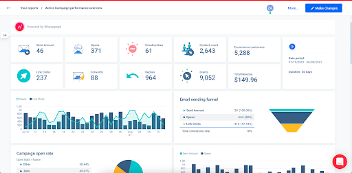
Overview
Whatagraph is a cloud-based reporting platform that provides automated report generation and visualization for digital marketing campaigns. It allows users to connect multiple data sources and generate visual reports, which can be customized and shared with team members and clients.
Top Features
- Automated report generation
- Customizable visualizations
- Multiple data source integration
- Drag-and-drop report builder
- Real-time data updates
- Collaboration features
Data Connectivity and Integration
Whatagraph offers integration with a wide range of data sources, including popular advertising platforms such as Google Ads, Facebook Ads, and Instagram Ads, as well as social media platforms like Facebook, Instagram, and Twitter.
It also integrates with Google Analytics, Mailchimp, and other popular marketing tools. Whatagraph makes it easy to import data from these sources, and users can choose to import data automatically or on a schedule.
Data Visualization and Analysis
Whatagraph provides a drag-and-drop report builder, allowing users to create custom reports with various visualization options.
Users can choose from various chart types, including line, bar, and pie charts, and customize the charts' appearance with different colors, fonts, and styles.
Whatagraph also provides features such as comparison graphs, trendlines, and data tables, which make it easy to analyze data and identify trends.
Collaboration and Sharing
Whatagraph provides features that enable collaboration and sharing of reports. Users can create and share reports with their team members or clients by generating a unique link, embedding a report on a website, or scheduling email reports.
The tool also provides commenting features that allow team members to discuss specific data points or insights, and users can customize access to reports based on team roles and permissions.
Pricing:
Whatagraph offers a range of pricing plans starting from $99/month. The plans differ in the number of integrations, report templates, and users allowed. The tool also provides a 7-day free trial.
Pros:
- Easy-to-use drag-and-drop report builder
- Wide range of data source integrations
- Customizable visualizations and templates
- Automated report generation saves time
- Real-time data updates keep reports up-to-date
Cons:
- Limited customization options for some chart types
- Some users have reported slow report generation and loading times
- Some users may need to learn how to set up integrations and build reports.
9. Geckoboard
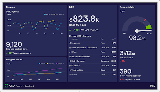
Overview
Geckoboard is a cloud-based dashboard tool that provides real-time visualizations for businesses to track key performance indicators (KPIs). It offers a range of visualization options and integration with a variety of data sources, making it easy for businesses to monitor their performance metrics in real time and make data-driven decisions.
Top Features
- Customizable dashboards
- Wide range of data source integrations
- Real-time data updates
- Interactive visualizations
- Customizable alerts and notifications
- Team collaboration features
Data Connectivity and Integration
Geckoboard offers integration with over 60 data sources, including Google Analytics, Salesforce, and Slack, making it easy to connect data from multiple sources in a single dashboard.
The tool offers a variety of pre-built integrations as well as the option to build custom integrations using APIs. It also provides an API for exporting data from Geckoboard, allowing users to access their data from other applications.
Data Visualization and Analysis
Geckoboard provides a range of visualization options, including line graphs, bar charts, pie charts, and tables. It offers real-time data updates and interactive visualizations that allow users to drill down into the data and explore trends and patterns.
Users can also set up alerts and notifications to receive updates when specific metrics exceed or fall below a certain threshold.
Collaboration and Sharing
Geckoboard provides features for team collaboration, including the ability to share dashboards with team members and set up custom user roles and permissions. Users can also add comments and annotations to specific data points and share these insights with their team.
The tool also allows users to embed their dashboards in other applications or websites and share them with external stakeholders.
Pricing:
Geckoboard offers a range of pricing plans starting from $39/month. The plans differ in the number of dashboards and data sources allowed. The tool also provides a 30-day free trial.
Pros:
- Wide range of data source integrations
- Customizable and interactive visualizations
- Real-time data updates keep users informed
- Customizable alerts and notifications help users stay on top of changes
- Team collaboration features make it easy to share insights
Cons:
- Some users may find the pricing plans expensive compared to other dashboard tools
- Limited customization options for some visualization types
- Some users may need to learn how to set up integrations and customize their dashboards.
10. Dundas BI
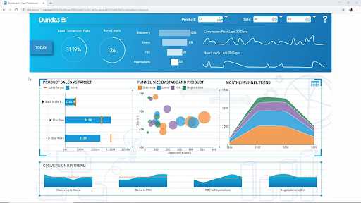
Overview
Dundas BI is a business intelligence and data analytics platform that allows businesses to connect, visualize, and analyze their data. The tool provides a range of visualization options and advanced analytics capabilities, allowing users to gain insights into their business performance and make data-driven decisions.
Top Features
- Customizable dashboards
- Advanced analytics and data modeling capabilities
- Collaborative features for team collaboration
- Automated reporting and data distribution
- Mobile access for on-the-go data access
Data Connectivity and Integration
Dundas BI offers integration with a wide range of data sources, including databases, cloud services, and spreadsheets. The tool also provides an open API, allowing users to create custom connectors to integrate data from other sources.
Dundas BI also offers advanced data modeling capabilities, allowing users to create complex data models and automate data transformation processes.
Data Visualization and Analysis
Dundas BI provides a range of visualization options, including charts, maps, and gauges. The tool also offers advanced analytics capabilities, including predictive modeling, machine learning, and data mining.
Users can also create custom dashboards and reports using drag-and-drop functionality and customize their visualizations to meet their specific needs.
Collaboration and Sharing
Dundas BI provides features for team collaboration, including the ability to share dashboards and reports with team members and set up custom user roles and permissions. Users can also add comments and annotations to specific data points and share these insights with their team.
The tool also offers automated reporting and data distribution, allowing users to schedule reports and send them to specific recipients.
Pricing:
Dundas BI offers a range of pricing plans, including a free trial version and a free community edition. The paid plans start at $5,000 per year for a single user license and vary based on the number of users and data sources.
Pros:
- Advanced analytics and data modeling capabilities
- Collaborative features for team collaboration
- Mobile access for on-the-go data access
- Automated reporting and data distribution saves time
- Customizable dashboards and visualizations
Cons:
- The tool may be more complex and require more technical expertise than some other BI tools
- Some users may find the pricing plans expensive compared to other dashboard tools
- Limited support for data cleansing and data quality control
11. GoodData

Overview
GoodData is a cloud-based business intelligence platform that enables businesses to connect, analyze and visualize their data. The tool offers a range of features to help businesses gain insights into their data, including advanced analytics capabilities, customizable dashboards, and collaboration tools.
Top Features
- Customizable dashboards and visualizations
- Advanced analytics capabilities, including predictive modeling and machine learning
- Scalable data integration capabilities
- Collaborative features for team collaboration
- Mobile access for on-the-go data access
Data Connectivity and Integration
GoodData offers a range of data connectivity options, including support for a variety of data sources such as databases, cloud services, and spreadsheets. The tool also provides scalable data integration capabilities, allowing users to manage large volumes of data with ease.
GoodData also offers an open API, enabling users to create custom integrations with other data sources.
Data Visualization and Analysis
GoodData offers a range of visualization options, including charts, tables, and graphs. The tool also provides advanced analytics capabilities, including predictive modeling and machine learning, enabling users to gain deeper insights into their data.
Users can also create custom dashboards and reports using drag-and-drop functionality, and customize their visualizations to meet their specific needs.
Collaboration and Sharing
GoodData provides features for team collaboration, including the ability to share dashboards and reports with team members and set up custom user roles and permissions. Users can also add comments and annotations to specific data points and share these insights with their team.
The tool also offers automated reporting and data distribution, allowing users to schedule reports and send them to specific recipients.
Pricing:
GoodData offers a range of pricing plans, including a free trial version and a custom pricing plan for enterprise customers. The paid plans start at $45 per user per month, and vary based on the number of users and data sources.
Pros:
- Advanced analytics capabilities, including predictive modeling and machine learning
- Collaborative features for team collaboration
- Mobile access for on-the-go data access
- Scalable data integration capabilities
- Customizable dashboards and visualizations
Cons:
- Some users may find the pricing plans expensive compared to other BI tools
- Limited support for data cleansing and data quality control
- Users may require technical expertise to use some of the advanced features.
12. Cyfe
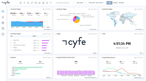
Overview
Cyfe is a cloud-based business intelligence and analytics platform that allows businesses to connect, analyze, and visualize their data from a single dashboard. The tool offers a range of features, including real-time data monitoring, customizable dashboards, and integration with a wide range of data sources.
Top Features
- Customizable dashboards and visualizations
- Real-time data monitoring and alerts
- Integration with over 100 data sources
- Automated report generation and data sharing
- Data visualization and analytics tools
Data Connectivity and Integration
Cyfe offers integration with over 100 data sources, including popular business applications such as Google Analytics, Salesforce, and Facebook. The tool also provides custom data connectors, allowing users to connect to their own internal data sources.
Cyfe also offers an open API, enabling users to create custom integrations with other data sources.
Data Visualization and Analysis
Cyfe provides a range of visualization options, including charts, tables, and graphs. The tool also offers data analytics tools, allowing users to gain insights into their data and track key metrics over time.
Users can create custom dashboards and reports using drag-and-drop functionality and customize their visualizations to meet their specific needs.
Collaboration and Sharing
Cyfe provides features for team collaboration, including the ability to share dashboards and reports with team members and set up custom user roles and permissions. Users can also add comments and annotations to specific data points and share these insights with their team.
The tool also offers automated reporting and data distribution, allowing users to schedule reports and send them to specific recipients.
Pricing:
Cyfe offers a range of pricing plans, including a free plan with limited features and a premium plan starting at $29 per month per user. The premium plan includes access to all features and integration with unlimited data sources.
Pros:
- Integration with over 100 data sources
- Real-time data monitoring and alerts
- Customizable dashboards and visualizations
- Automated report generation and data sharing
- User-friendly interface
Cons:
- Limited advanced analytics capabilities compared to other BI tools
- Some users may find the pricing plans expensive compared to other BI tools
- Limited support for data cleansing and data quality control
Conclusion
Looker Studio is a popular business intelligence tool that allows businesses to connect, analyze, and visualize their data. However, several Looker Studio alternatives offer similar or even better features, depending on the business's specific needs.
Some of the top Looker Studio alternatives include Tableau, Power BI, QlikView, Sisense, Klipfolio, Whatagraph, Geckoboard, Dundas BI, GoodData, and Cyfe. Each tool offers unique features and capabilities, such as data visualization and analysis, data connectivity and integration, collaboration and sharing, and pricing.
When considering an alternative to Looker Studio, businesses should consider factors such as the size of their data, the number of users, their budget, and their specific business needs. They should also consider data security, ease of use, and customer support when evaluating different BI tools.
Ultimately, the choice of Looker Studio alternative will depend on the business's specific requirements. By carefully evaluating different options and considering these factors, businesses can choose the best BI tool to help them make data-driven decisions and achieve their goals.
FAQs on Looker Studio Alternatives
What is better than Looker Studio?
Determining what is "better" than Looker Studio depends on the specific needs and priorities of a business. There are several Looker Studio alternatives that offer similar or even better features depending on the requirements of the organization.
For example, Arena is a popular alternative that provide robust data visualization and analysis capabilities. Sisense offers a powerful data engine that can handle large datasets and complex queries. QlikView and Dundas BI offer advanced data integration and connectivity options.
Klipfolio, Whatagraph, Geckoboard, and Cyfe are other Looker Studio alternatives that specialize in data dashboarding, collaboration, and sharing. GoodData offers comprehensive analytics capabilities for large organizations.
Ultimately, the choice of Looker Studio alternative will depend on the specific requirements of the business. It is important to evaluate different options based on factors such as data security, ease of use, customer support, data connectivity and integration, data visualization and analysis, and pricing. By carefully considering these factors, businesses can choose the best BI tool to help them make data-driven decisions and achieve their goals.
Are there any alternatives that offer both cloud-based and on-premise deployment options?
Yes, there are several Looker Studio alternatives that offer both cloud-based and on-premise deployment options. Here are some examples:
- Arena Calibrate
- Tableau
- Power BI
- QlikView
- Sisense
- GoodData
These alternatives offer businesses the flexibility to choose the deployment option that best suits their needs and preferences. It is important to carefully evaluate each option based on factors such as cost, scalability, security, and ease of use before making a decision.
How easy is it to migrate from one analytics platform to another?
The ease of migrating from one analytics platform to another depends on various factors, such as the complexity of the data being migrated, the level of customization in the current platform, and the level of integration with other systems.
However, in general, migrating from one analytics platform to another can be a complex and time-consuming process.
The first step in the migration process is to identify the data that needs to be migrated and how it will be mapped to the new platform. This involves analyzing the data structures and relationships and identifying any discrepancies or inconsistencies.
The second step is to extract the data from the current platform and transform it into a format that can be imported into the new platform. This may involve cleaning and restructuring the data and ensuring that it is compatible with the new platform's data model.
The third step is to load the data into the new platform and configure it to match the business requirements. This may involve setting up new data models, creating dashboards and reports, and configuring security and user access.
Throughout the migration process, it is important to ensure that data integrity is maintained and that there is minimal disruption to business operations. This may require thorough testing and validation of the new platform before it is fully deployed.
In summary, migrating from one analytics platform to another can be a complex and challenging process. It requires careful planning, thorough testing, and a deep understanding of the data structures and relationships involved.
Businesses should carefully evaluate their options before making the decision to migrate and should seek the assistance of experienced professionals to ensure a successful migration.
Is Arena Calibrate similar to Looker Studio?
Arena Calibrate and Looker Studio are both business intelligence tools that provide data visualization and analysis capabilities, but they have some differences in terms of their features and functionalities.
Arena Calibrate is a comprehensive data analysis, modeling, and simulation platform that enables organizations to optimize their operations, production processes, and supply chains. It focuses on manufacturing and industrial operations and helps businesses to collect, organize, and analyze data from multiple sources.
Arena Calibrate offers simulation tools and predictive analytics to help businesses make data-driven decisions and optimize their operations for better results.


