
According to a study by 3M Corporation, the human brain processes visual information 60,000 times faster than text. In the age of information, data is an invaluable asset, but its true power lies in how effectively it can be communicated.
The global data visualization market is projected to reach $19.2 billion by 2027, reflecting the increasing importance of data presentation. Hence, data visualization serves as the bridge between raw data and meaningful insights, making it an indispensable tool for decision-makers in various fields.
This article will provide a comprehensive guide to data visualization types, offering essential insights and practical tips to help you harness the full potential of your data. Whether you are a seasoned data analyst or just starting your data journey, understanding the diverse array of data visualization techniques at your disposal is key to unlocking the stories hidden within your datasets.
Must-Know Data Visualization Types for Marketers
Mentioned below are the three most popular data visualization types that marketers use often:
- Basic Data Visualization Techniques: These fundamental techniques, like bar charts and line graphs, offer simple and clear representations of data for easy understanding.
- Comparison Visualization Techniques: Utilizing methods like pie charts and histograms, these techniques facilitate the comparison of data sets to identify patterns and variances effectively.
- Time-based Visualization Techniques: Time-based techniques such as Gantt charts and timelines help visualize data changes and trends over specific periods, aiding in tracking performance and making temporal insights accessible.
- Relationship Visualization Techniques: Techniques like scatter plots and network graphs reveal connections, dependencies, and correlations within data, enabling a deeper understanding of relationships between variables and data points.
Basic Data Visualization Techniques
Bar Charts
Bar charts are a widely used data visualization technique that represent data in rectangular bars, with the length or height of each bar corresponding to the value it represents. They are effective for displaying and comparing categorical data and are especially useful for showing trends or comparisons between different categories.
Real-life examples of bar charts include a sales report depicting monthly revenue for a retail store, where each bar represents the revenue for a specific month; a survey results summary displaying the number of respondents who preferred different brands of smartphones; and an educational performance analysis illustrating the grades achieved by students in various subjects.
Bar charts provide a straightforward and intuitive way to visualize data, making them a versatile tool in data analysis and communication.
Line Charts
Line charts are a fundamental data visualization method that uses lines to connect data points, typically showing how data changes over time. They are ideal for illustrating trends, patterns, and continuous data relationships.
Real-life examples of line charts include a stock market performance chart, where the line represents the fluctuation of a stock's price over a period; a weather forecast graph showing temperature variations throughout the day; and a website analytics report tracking website traffic over weeks or months, revealing user engagement patterns.
Line charts are invaluable for visualizing and analyzing data that evolves continuously, offering a clear and concise way to convey temporal information.
Pie Charts
Pie charts are a visual representation that divides data into segments, with each segment's size proportional to its percentage of the whole. They are suitable for displaying parts of a whole and are often used to represent categorical data.
Real-life examples of pie charts include a budget breakdown, showing the allocation of expenses across categories like housing, food, and entertainment; a market share analysis, illustrating the distribution of market dominance among competing companies in an industry; and a survey result summary, displaying the distribution of responses to a multiple-choice question, such as favorite ice cream flavors among a group of people.
Pie charts offer a quick and easy way to grasp the relative proportions of different categories within a dataset, making them valuable for conveying information at a glance.
Scatter Plots
Scatter plots are a graphical representation used to display the relationship between two numerical variables. Each data point on the plot represents a combination of values from the two variables, and their position on the chart can reveal patterns, correlations, or trends.
Real-life examples of scatter plots include a study examining the correlation between a person's age and their income level, where each point represents an individual's age and income; a manufacturing process analysis plotting the relationship between machine speed and defect rate to identify optimal production settings; and a climate change research study displaying the relationship between atmospheric CO2 concentration and global temperature changes over time to visualize the correlation.
Scatter plots are essential for exploring and understanding how two variables interact and influence each other within a dataset.
Comparison Visualization Techniques
Column Charts
Column charts, also known as vertical bar charts, are a popular data visualization tool that uses vertical bars to represent data categories, with the height of each bar corresponding to the data value it represents. They are commonly used to compare discrete categories and their values.
Real-life examples of column charts include a monthly sales report for a retail store, where each column represents the sales revenue for a specific month; a population distribution chart for different age groups in a demographic analysis; and a project timeline showing the duration of various tasks or phases in a project plan.
Column charts provide a straightforward and effective means to visualize data comparisons and trends, making them widely applicable in business, research, and many other fields.
Stacked Bar Charts
Stacked bar charts are a data visualization technique that combines multiple bar charts into a single representation, stacking the bars on top of each other to show the composition of a whole category while also comparing subcategories within it. These charts are useful when you want to illustrate both the total and the individual components of a category.
Real-life examples of stacked bar charts include a financial report displaying the allocation of a company's expenses across different departments for multiple quarters, where each bar represents a quarter, and the stacked segments represent departmental expenses; a survey analysis representing the distribution of people's preferred modes of transportation for different age groups, illustrating the mode choices within each age group; and a resource allocation chart in project management, showing how project resources are divided among various tasks or project phases.
Stacked bar charts offer a clear visual representation of how different components contribute to a whole, aiding in data-driven decision-making and analysis.
Radar Charts
Radar charts, also known as spider charts or web charts, are a unique data visualization method that displays multivariate data on a two-dimensional plane with multiple axes emanating from a central point. They are particularly useful for comparing the performance or attributes of different items across multiple categories simultaneously.
Real-life examples of radar charts include a sports player's performance assessment, where the chart displays their proficiency in various skills such as speed, accuracy, and endurance; a candidate's evaluation in a job interview, showcasing their abilities in communication, technical skills, teamwork, and more; and a product comparison chart, illustrating the strengths and weaknesses of different products across criteria like price, quality, and features.
Radar charts enable a holistic view of complex data relationships and are valuable when evaluating items with diverse attributes or characteristics.
Waterfall Charts
Waterfall charts are a specialized data visualization tool used to represent the cumulative effect of sequentially occurring positive and negative values in a dataset. They are particularly valuable for understanding the incremental impact of various factors on a final total.
Real-life examples of waterfall charts include a financial statement analysis, demonstrating the change in a company's net income as it moves through revenue, expenses, and other financial components; a project budget breakdown, displaying how initial budget allocations evolve over time due to cost overruns or savings; and a sales performance report, showing the step-by-step contributions of different products or regions to the overall sales figure.
Waterfall charts provide a clear visual representation of how values change and accumulate over a series of steps, making them effective for illustrating the flow of data in various scenarios. Unfortunately, I cannot provide images as they require visual content.
Relationship Visualization Techniques
Bubble Charts
Bubble charts are a data visualization technique that combines elements of scatter plots with the addition of bubble size to represent a third variable. Each data point is depicted as a bubble on a two-dimensional plane, with its position determined by two variables and its size indicating a third variable.
Real-life examples of bubble charts include a population analysis chart displaying countries' GDP (x-axis), life expectancy (y-axis), and the size of bubbles representing population size; a project management chart illustrating tasks with their start and end dates (x and y axes), with bubble size representing the task's priority or complexity; and a marketing analysis chart plotting ad campaign performance based on ad spend (x-axis), click-through rate (y-axis), and bubble size indicating conversion rate.
Bubble charts offer a visually engaging way to analyze three variables simultaneously, making them valuable for exploring complex datasets with multivariate relationships.
Network Diagrams
Network diagrams are a visual representation of interconnected elements, often used to illustrate complex relationships, processes, or systems. They consist of nodes (representing entities) and edges (representing connections or relationships between nodes).
Real-life examples of network diagrams include an organizational chart showing the hierarchy and reporting relationships within a company, with employees as nodes and lines indicating their supervisory connections; a social network analysis diagram mapping connections between individuals in a community or on social media platforms; and an IT infrastructure diagram depicting the components and connections of a computer network, including servers, routers, and workstations.
Network diagrams are essential for understanding, planning, and optimizing intricate systems, whether in business, social interactions, or technology.
Chord Diagrams
Chord diagrams are a unique data visualization method used to display relationships and connections between data points in a circular layout. They are particularly useful when visualizing complex networks and interactions.
Real-life examples of chord diagrams include a trade flow visualization, demonstrating the import and export relationships between different countries or regions; a music genre analysis, illustrating the connections between various genres based on artist collaborations and influences; and a web traffic analysis, showing the flow of website visitors between different pages or sections, highlighting user navigation patterns.
Chord diagrams offer a visually appealing way to represent interconnected data and uncover patterns and associations within intricate systems or datasets.
Time-based Visualization Techniques
Gantt Charts
Gantt charts are a popular project management tool used to visualize and track the schedule of tasks and activities in a project over time. They consist of horizontal bars, with each bar representing a specific task, and their length indicating the task's duration.
Real-life examples of Gantt charts include a construction project plan, outlining when different construction phases will occur and how they overlap; a software development timeline, displaying the start and end dates of coding, testing, and deployment stages; and an event planning schedule, detailing the preparation and execution of tasks leading up to an event, such as a wedding or conference.
Gantt charts provide project managers and teams with a clear visual roadmap, helping them manage tasks, allocate resources, and meet project deadlines efficiently.
Timeline Charts
Timeline charts, also known as linear timelines, are a straightforward data visualization tool used to represent events or activities in chronological order along a single axis. They offer a clear and concise way to illustrate the timing and duration of various events.
Real-life examples of timeline charts include a historical timeline showcasing key events in a specific era or period; a project timeline charting the milestones and deadlines for a product launch; and a company's organizational history, highlighting significant developments and milestones since its establishment.
Timeline charts are versatile and can be used in various contexts, from history and project management to personal biographies, to convey a sense of time and sequence visually.
Calendar Heat Maps
Calendar heat maps are a visual representation of data over time, with each day or date displayed as a square or cell, and the color intensity or shading representing the data value for that specific time period. They are effective for revealing patterns, trends, and variations in data across days, weeks, or months.
Real-life examples of calendar heat maps include a fitness tracker displaying daily step counts with colors indicating activity intensity over the course of a year; a weather app using color-coded squares to show daily temperature variations throughout a month; and a financial analysis tool highlighting trading volume changes in stocks over several weeks, with darker shades indicating higher trading activity.
Calendar heat maps provide an intuitive way to visualize temporal data, making them valuable for various applications, from health monitoring to financial analysis.
Area Charts
Area charts are a data visualization method that builds upon line charts by filling the area beneath the line with color, creating a visual representation of the cumulative values. They are effective for showing trends, especially when comparing multiple datasets.
Real-life examples of area charts include a stock market performance graph illustrating the fluctuation in the value of a stock over time, with the shaded area under the line indicating the total market capitalization; an energy consumption report displaying the electricity usage for different appliances in a household, with each area representing a specific device's consumption; and a population growth chart for a city, where the filled area under the line represents the total population increase.
Area charts are valuable for emphasizing the magnitude of changes over time and are widely used in financial analysis, data reporting, and various other fields.
Tips for Choosing the Right Graph or Chart for Your Data
Understand Data
Understanding your data is the foundation for effective data visualization. Start by examining the nature of your data, whether it's categorical or numerical, and its distribution. This step helps you grasp the inherent characteristics of your dataset, such as its size, granularity, and variability.
Understanding these aspects will guide your choice of visualization method and ensure that your representation accurately conveys the data's story.
Define Objectives
Defining clear objectives is the next crucial step. Determine the message you want to convey through your visualization. Are you aiming to showcase comparisons, highlight trends, or display distributions? Understanding your goals will help you select the most suitable visualization type and design.
Consider the Data Characteristics
After defining your objectives, consider the data characteristics. Evaluate factors like the data's size, complexity, and dimensionality. For extensive or intricate datasets, you might opt for simpler visualizations to prevent information overload. Identifying key variables is essential; focus on the most relevant and impactful data points that align with your objectives.
Identify Key Variables
Identifying key variables is a critical step in the data visualization process. Key variables are the specific data points or attributes that are most relevant to your objectives and the message you want to convey through the visualization.
These variables are the building blocks of your chart or graph, and their selection should align closely with your goals. For example, if you're creating a sales report, key variables may include product categories, sales figures, and time periods.
Choose the Visualization Type
Choosing the right visualization type is a critical decision. It should align with your data type, objectives, and key variables. For instance, bar charts are excellent for comparing data, while line charts are suitable for displaying trends over time. Scatter plots work well for identifying relationships between variables, and pie charts are useful for showing part-to-whole relationships.
Match Visualization to Data Relationships
Matching the visualization to data relationships involves selecting the appropriate chart or graph that effectively represents the specific data relationships you want to highlight. For instance, you might choose a stacked area chart to visualize the cumulative contribution of multiple variables over time, or a chord diagram to illustrate complex connections between data points.
Consider Audience and Context
Lastly, consider your audience and the context in which your visualization will be presented. Tailor your visualization to your audience's level of expertise, ensuring that it's accessible and understandable.
Also, take into account the context of the presentation—whether it's for a scientific paper, a business presentation, or a public report—and adapt your visualization style and complexity accordingly. These considerations will help ensure that your data visualization effectively communicates your message to your intended audience.
Arena Calibrate - Powerful Tool for Data Visualization
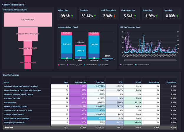
Arena Calibrate emerges as a powerhouse in the realm of data visualization, offering a diverse spectrum of visualization types that cater to varying business needs. From essential bar and line charts to more advanced heatmaps and scatter plots, this tool provides a comprehensive toolkit for transforming raw data into compelling insights.
This versatility ensures that users can choose the most suitable visualization method to effectively communicate their data-driven narratives. So, what sets Arena Calibrate apart from the rest?
- Versatile Visualization Types: Arena Calibrate offers a wide range of visualization types, including bar charts, line charts, heatmaps, and scatter plots, ensuring suitability for various data presentation needs.
- Real-time Data Integration: Arena Calibrate stands out by seamlessly integrating real-time data updates, allowing users to work with the latest information and make timely decisions.
- Collaborative Capabilities: Unlike many competitors, Arena Calibrate facilitates real-time collaboration, enabling teams to collaborate efficiently, speeding up decision-making processes.
Common Mistakes in Choosing Data Visualization Types
- Choosing the Wrong Chart Type: Selecting an inappropriate chart type that doesn't effectively represent the data or its relationships.
- Overcrowding the Chart: Overloading the visualization with excessive data or elements, making it difficult to interpret.
- Using 3D Charts Unnecessarily: Employing three-dimensional charts when simpler two-dimensional options would suffice, potentially distorting data perception.
- Ignoring the Audience: Failing to consider the audience's knowledge level and specific needs when designing the visualization.
- Misleading Scales and Axes: Manipulating scales and axes to exaggerate or diminish data, leading to inaccurate interpretations.
- Lack of Context: Presenting data without providing adequate context or explanations, leaving viewers without a clear understanding.
- Using Too Many Colors: Overusing colors in a chart, causing confusion or distraction rather than enhancing comprehension.
- Poor Labeling and Titles: Neglecting to label data points, axes, or provide clear titles, leaving viewers puzzled about the chart's purpose or meaning.
Conclusion
In conclusion, choosing the right data visualization type is a pivotal step in effectively conveying insights from your data. By understanding your data, defining clear objectives, and considering your audience, you can make informed decisions in selecting the appropriate visualization method.
Remember the common pitfalls to avoid, such as overcrowding, misleading scales, and poor labeling. Embracing data visualization tools can further elevate your ability to transform complex data into meaningful, actionable information, ultimately benefiting your business by facilitating better decision-making and improved communication of insights.
FAQ on Data Visualization Types
What are the 4 main types of data visualizations in the report view?
The 4 Main Types of Data Visualizations in the report view are:
- Charts and Graphs: These include bar charts, line charts, pie charts, scatter plots, and more, used to represent numerical data in various formats.
- Maps and Geospatial Visualizations: Geographic data is represented using maps, heatmaps, choropleth maps, and other geospatial techniques.
- Tables and Matrices: These display data in tabular form, making it easy to compare and analyze values.
- Infographics and Dashboards: These combine various visual elements like charts, text, and images to provide a comprehensive overview of data.
How do we select chart types for visualizing data?
Selecting chart types for visualizing data involves several considerations:
- Understand your data and its characteristics.
- Define your objectives and the message you want to convey.
- Consider the relationships within the data.
- Think about your audience and their familiarity with different chart types.
- Choose a chart that aligns with your objectives, data type, and audience's needs.
What are the 4 most commonly used types of chart for data visualization?
The 4 most commonly used types of charts for data visualization are:
- Bar Charts: For comparing categories or discrete data points.
- Line Charts: Great for showing trends over time or continuous data.
- Pie Charts: Effective for displaying part-to-whole relationships.
- Scatter Plots: Useful for visualizing the relationship between two variables.
What are the common data visualization techniques?
Common data visualization techniques include stacked bar charts, heatmaps, area charts, bubble charts, Gantt charts, radar charts, waterfall charts, calendar heat maps, network diagrams, chord diagrams, timeline charts, and more, depending on the specific needs and characteristics of the data you are working with. The choice of data visualization technique or chart type depends on the specific data you have, your goals, and the best way to communicate your message to your target audience effectively.


