No matter how comprehensive or rich your data is, it’s of minimal value if it fails to deliver insights. Providing numbers is not enough. For data to paint the full picture it needs to be woven into a story. Doing so provides contextual scenarios that allow your readers to visualize the repercussions implied by the data.
For example, you could say that:
- a predicted 7% drop in Google rankings is on the horizon should the SEO team not receive additional funding for outreach.
Or, you could say that a 7% drop in rankings will result in…
- A severe backdrop in traffic, CTRs and ROI, which in turn would hamper sales by 13%, creating a ripple effect through every department in the company. This means another failed quarter, more layoffs, less promotions, zero bonuses and the reality of having to take out another loan.
Managers will be obliged to work overtime to keep the company afloat and employees will likely resign to work elsewhere, on a ship that isn’t sinking.
Can you see how we created a story with data?
Through the art of storytelling, we’ve added context to our numbers, helping to weave a narrative that adds impact and leaves an impression on readers. Data storytelling is the tool that allows marketers to unpack the meaning behind their numbers and pull readers closer to their research.
Adding this depth to your data is what inspires people to take action based on the recommendations you’ve provided.
In this post we’ll examine why data storytelling is important, highlight ways to create a compelling story with data and show how you can implement it in your client reports.
What is data storytelling and why is it crucial to marketers?
Data storytelling from a marketing performance perspective is all about creating narratives and underlining why data changes over a period of time. Although this is often done through visuals, it’s by no means the crux of the matter. Yes, illustrations are important, yet they should help convey the meaning of your data in a way that’s just as comprehensible as it is compelling.
But when it boils down to it, the entire data storytelling process is about blending the complexity of data and numbers into the real-life situations that resonate with humans.
If you can wrap your data into a story, then your insights will be translated into a way that makes them more meaningful and relevant. This will bolster decision-making and inspire your clients to take action.
Here’s how.
- Data storytelling enhances meaning and value
For any of our data to make sense to our clients, we need to leverage storytelling as our tool to connect the dots for them. When you do this, you provide readers with an insight that spurs decision-making.
When we opened this article with statistics about the consequences of a drop in google rankings, we attached it to consequential scenarios that provide context and an emphasis on the severity of the situation.
Without the inclusion of these cataclysmic events, how would you know what a drop in SEO rankings would affect the bottom line of sales and company trajectory?

Before: a predicted 7% drop in Google rankings is on the horizon should the SEO team not receive additional funding for outreach.
After: A severe backdrop in traffic, CTRs and ROI, which in turn would hamper sales by 13%, creating a ripple effect through every department in the company. This means another failed quarter, more layoffs, less promotions, zero bonuses and the reality of having to take out another loan.
- Data storytelling is Marketing gold
We live in a world that’s drowning in marketing and data. To gravitate people closer to your brand, you need to stand out from the crowd through unique storytelling.
One of the greatest advantages of having data that none of your competitors has is that you can tell a story in a way that nobody else can. After all, having unique data allows you to tell a unique story.
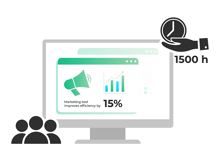
For example, if you have a marketing tool that can improve efficiency by 15%, how would this benefit be translated in a way that resonates with your target market? If time consuming marketing processes is its pain point, then highlight the number of hours your tool will save in a year (see example below).
If it’s more financial, then convert the number of hours an employee would have to complete into how much this would cost you.
Unravelling the importance behind the numbers through a compelling story is going to turn heads and provide clear insights into an unexplored topic or even encourage people to view certain issues from a different perspective.
Publishers are also hungry for compelling content and if your story can tick all of the boxes, then you might even be able to get some high-profile publications under your belt.
- Your message will be more memorable
It’s easy to forget stats, facts and percentages since they only appeal to the analytical side of the brain. If you lay everything out on a spreadsheet, your clients will remember very little. But if you wrap it all into a story, you’ll tap into their emotions, appealing to both sides of the brain and therefore make your message more sticky. Let’s have a look at this in more detail.
Example without data storytelling:
Investing in data management software would automate processes, save time and improve efficiency by 15%.
Example with data storytelling
Investing in data management software would automate processes, save time and improve efficiency by 15%. This would give us an extra 6 hours a week, 24 hours a month and 288 hours a year to invest in other marketing activities.
How to tell a powerful story with your data and analytics
Any story told since the beginning of time has involved these three key elements. Let’s have a look at each stage in detail.
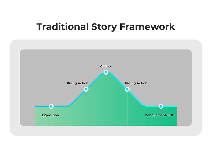
First Storytelling Stage: The setup
The first stage involves the build up of events and a description of facts, figures, places and settings. This is where you want to integrate and relate your data to addressable issues that your target market will find relevant and interesting.
It’s all about adding context and laying the foundations that will create momentum to the crux of the story.
- Begin with a description of the challenge(s) or the opportunity that the data suggests.
- Then look to illustrate these problems with visuals to help your readers gain a firmer understanding of the scenario.
Below are some common types of data visualization:

- Line graphs: allow you to highlight changes in continuous data over a period of time.
- Bar charts: enable you to quickly visualize and estimate key values at a glance. They’re also easy to understand and are commonly used in the business world.
- Tables: provide you with an easy way of displaying a number of categories simultaneously.
- Maps: display data spatially that allow you to visualize concepts across geographic regions whilst highlighting its impact on outcomes.
Second Storytelling Stage: The Climax
At this point, all of the data you’ve ladled into a story should be bubbling to a point of climax that includes conflicts and complications. Here is where you get into the heart of the matter that will push readers towards an insight.
It’s best at this point in the story to describe the impacts or challenges that your problem or opportunity poses. Using our example from the beginning, we stated that scientists were concerned about the effects of having the Earth’s temperatures increased by two degrees.
We then reached a climactic point by outlining the detrimental effects that this would have on the planet.
‘Periodic 6-week heat waves, a 7% increase in rainfall, 50cm rise in sea levels, intensified hurricanes, more drought, more wildfires, more pandemics, and an increase in completely uninhabitable land.’
Despite the cataclysmic nature of these events, we made the data and the situation more relatable by comparing the climate transformations of London and New York. This is one of the best techniques you can use to make your data resonate with your readers.
For example, instead of just saying that the world lost 12 million hectares of tropical rainforest last year, you could strengthen the visualization of this figure by saying that this amounts to the same land mass as South Korea.
Second Storytelling Stage: The Resolution
The final stage of the story is to end with a recommendation or a plan of action on what steps need to be taken next. Your recommendation should be founded in logic to add credibility to the decision you’re trying to derive from the data. In this section you should outline the risks and the rewards that come from implementing your proposed plan of action.
Conclusion: Bringing it all together
Data storytelling is all about creating a narrative to help convey the meaning of your data in a way that resonates with readers emotionally. The objective is to provide insight through context. Marketers today need to blend data with human connection to satisfy both the analytical and emotional parts of our brain. Doing so will maximize engagement, drive persuasion and most importantly, compel your readers to take action based on your recommendations.